Sunday 18 December 2016

Contents Page Progression Part 3

Now that I have the upper half of my page completed, I can now add my text to the bottom half.

I've continued to use black boxes with yellow text for the headings of this page as this will give me a house style. The font I've used for the text is very simplistic as this is much more appealing to the audience as it spaces out the words and is not cluttered. In addition to this I've continued my trend of having my page numbers as the same light green used in all of my magazine.

After writing up my features, I had to include other segments to this content page other than just features. I ended up using Albums, Win!, and Gigs as these break the columns up nicely.

Friday 2 December 2016

Contents Page Progression Part 2

Now that I have written the features that I will have on my page, I can now present them nicely on my page.

I've decided to call this artist Lil' Brittle. I've used green for the page number here which I will use throughout my magazine in order to have a house style.
From the magazine's I've researched, they had some form of line which sectioned off parts of the page. I've created a black bar in order to include this convention. The white text on the black background has once again been used on this page. The "Dynamic" used here is the same font and colour as my title on my front cover; I did add an outer glow to it as to make it stand out from the black background more.

Thursday 1 December 2016

Contents Page Progression Part 1

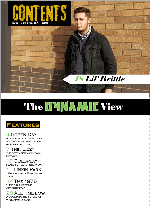
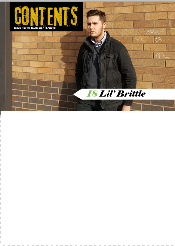
So I started by taking some photographs of a model similar to the models on my front cover,
This photo was taken at a medium shot and is taken from a landscape angle in order to fit  well with the flat plans I've previously drawn up.
I began by creating a page which was 20.5cm by 28.5cm. Next I inserted my image into the document and placed it accordingly, ensuring that the graffiti and the post were in frame.

I wanted to create a title on page to clearly show that this is the contents page. I also wanted to use black and yellow as they contrast very well.
Using the rectangle tool, I was able to create a black rectangle for my yellow title to be in. I used a font website to get the font I've used for 'Contents'. This font is similar to that of the types of fonts used in magazines I researched such as Kerrang!

An, extremely important convention of any magazine is an issue number and date. I've used white text on the black background as they work very well together.

Finally, I've added a white arrow using the rectangle tool and line tool. This is what I will write the name the artist.