Tuesday 31 January 2017

Double Paged Article Progression (Adding my selected image)

This was my article page before I've added the image. I believe that the gap needs to be filled with an other image to keep my article page interesting.

I've decided to use this image...

I've used the place tool to insert my selected image. I believe that this positioning is good as it is not too close to the credit as they need to be seen and not obstructed by the image.

Double Paged Article Progression (Deciding on a smaller image)

Double Paged Article Progression Part 3

Now that I have my article completely written up and my main image page complete, I am now ready to move onto Adobe InDesign.
I've used the place tool in order to retrieve my left page design which I created in Photoshop. I've went on and added the text into the columns.
I've changed the questions in my article to green by using the Eyedropper Tool to extract the green from the left hand page. I believe this was an important change as it not only allows the reader to easily identify the questions; this edit also continues my house style and its signature colours of black, white, and green.

Monday 30 January 2017

Double Paged Article Progression Part 2

So, for my article I wanted an entire page with an image of my models I'm going to use Photoshop to create this page as InDesign can't edit images in as much detail as Photoshop.
I used an other image I took when making my front cover. Using the mask tool, I was able to remove the background. I then used the Blur tool to soften the edges of my models. I've also added a white outline to my image using the Stroke tool. I believe this allows my image to stand out from the background as well as complimenting the title I will use.

The font I've used nicely stands out from the green background, this is important as the name of my band must be the first thing my reader will see.
Finally I added a quote from my article to the bottom of the page, this adds an idea of what my article is about for the reader which I believe is important to the page.

Friday 27 January 2017

Double Paged Article Progression Part 1

Firstly, I had to write an article for the band I've created for my magazine (Three Days Later). Before writing my article I had to research into how other magazines present their articles.
I had some peers look at two layouts for my article, they decided on a Q and A layout.
In the end I had 1179 words which should be enough text for my page.

This word document can now be transferred to Adobe InDesign where I can format the text a lot more.

Double Paged Spread Article Layout Discussion Results

I was to get some peers to decide which design I should use in my magazine. 

Design 1:

Design 2:


To conclude, I am going to use the Q and A layout, I believe that this will work well in my double paged spread.

Double Paged Spread Article Layout Disussion

I've began by leaving my article as a bit more of a narrative approach. This design was pretty basic but I feel like it needs a spaced out a bit more.

I then changed the layout so that it was more of a standard question and answer style, just like some of the most popular magazines such as 'Kerrang!'. I think that it is worth asking some peers for their opinion.

Tuesday 24 January 2017

Front Cover Progression editing my Barcode


After showing my front cover, to my audience, I've decided to make my barcode smaller. This is because when my audience viewed the front cover from afar. The barcode's size, in comparison to the rest of the page has let me to make it smaller.

Monday 23 January 2017

Front Cover Progression Colour Change Feedback

I've asked my target audience to decide which of the two front covers is more appealing, this is my results: 

Yellow 9/12
Green 3/12

Sunday 22 January 2017

Front Cover Progression Part 4


Since last time, I have changed my colour scheme to be more in line with my other pages, this change from green text to yellow will benefit me greatly. This will make my magazine stand out more as the yellow is much more eye catching than the light green I had previously.

Friday 20 January 2017

Front Cover Title Change

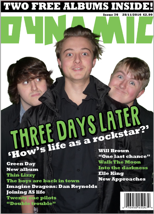
So far my front cover looks like this:

I decided to use some other designs and get my target audience to choose which of the titles they like the most.
 This is the original style I've used on my front cover. 3/10 people said they preferred this to the other two titles.
This style has simply changed the title colour to
green. 5/10 people I asked said that they preferred this style of the three titles.
Finally, this style has changed the positioning of the word 'Later'; plus the sub head is not on top of the title. 2/10 people said that this is the title style they preferred.


This is my front cover now. I believe that it looks better now as there is a better balance in that ratio of green and white.

Monday 9 January 2017

Contents Page Progression Part 4

Now that I have a suitable amount of text on the page, I think I need some other image.

I've decided to go with some information on how to subscribe to my magazine. This includes an image of my front cover and information on how to buy it via phone or by going onto the magazine's website.

Finally I added a page number to the bottom of the page. I also ensured that all of my text is lined up perfectly by using the grid function this leaves my contents page looking exceptionally good.