Tuesday 28 February 2017
Monday 27 February 2017

Sunday 26 February 2017
Evaluation Q6 (Part 3) What have you learnt about new technologies from the process of creating this product?
When creating my magazine I have used Adobe Photoshop and InDesign, as well as Microsoft Word in order to create my magazine. These tools have greatly enabled me to create something new as well as showing me how other media products are created. Some of the tools I've used include, screenshot, Quick Selection Tool and the Blur Tool.
Evaluation Q6 (Part 2) What have you learnt about new technologies from the process of creating this product?
I have presented my work in various forms using the internet. This has enabled me to be much more creative with my work than to simply write it down; by doing this I understand the importance of presentation and how effective it can be when trying to product a product. Websites I have used include: https://prezi.com/ , https://www.slideshare.net/ , www.slideboom.com/, https://www.emaze.com/,
https://www.powtoon.com/ , https://www.youtube.co.uk/ , and www.surveymonkey.co.uk/ .
By using these websites I am now a prosumer and not just a consumer as I have created content which millions of people can view from across the globe.
https://www.powtoon.com/ , https://www.youtube.co.uk/ , and www.surveymonkey.co.uk/ .
By using these websites I am now a prosumer and not just a consumer as I have created content which millions of people can view from across the globe.
Evaluation Q6 (Part 1) What have you learnt about new technologies from the process of creating this product?
Firstly, I am no longer a consumer and by using Blogger I have become a prosumer in the age of Web 2.0. The reason for this is that I have created a media text which can potentially be viewed by millions of people. Other websites such as YouTube also have this potential. I have used these website to present my podcasts and other filmed pieces.
Saturday 25 February 2017
Thursday 23 February 2017
Wednesday 22 February 2017
Tuesday 21 February 2017
Monday 13 February 2017
Saturday 11 February 2017
Evaluation Question 1 Planning
"In what ways does your media product use, develop or challenge forms and conventions of real media products?"
Conventions


Conventions
- Masthead
- Puff (Giveaways)
- Buzz words ("Free, exclusive")
- Barcode
- Coverline
- Main Coverline
- Strip
- House Style
- Splash (Main story plus headline)
- Exclusives
Examples of some magazines similar to mine: RollingStone, Q, Kerrang!.


Tuesday 7 February 2017
Contents Page Progression Part 4
Last time, I left off by adding articles to the bottom of my contents page as well as a gap in the bottom right. I was going to fill this spot with an image of an artist who was performing live, but when I asked my target audience, they responded by saying that if an image was there the two contents pages would be too alike, so it was better to simply add more articles.

So, I added more reviews about artists who are relevant to the rock music scene.
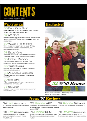 An other issue I had was that there was too much space above the image. I decided to fill in this space with a heading. By using the word "Exclusive", I am using buzz words which make my magazine more desirable to my audience.
 Finally, I added a page number and website link to my page as these were two extremely common conventions of the magazines I researched. Just like I did with my other pages, I used the grid tool to ensure that all of my text is lined up correctly.

So, I added more reviews about artists who are relevant to the rock music scene.


Sunday 5 February 2017
Contents Page 2 Progression Part 3
Now that the top section of my page has been completed I will add some news and reviews articles.

Thursday 2 February 2017
Contents Page 2 Progression Part 2


Contents Page 2 Progression Part 1


Wednesday 1 February 2017
Double Paged Article Progression Part 4

Since last time, I've increased the font size of one of the quotes in my article. This is a common convention in the magazine's I researched and will make my article more appealing to read. I also added a page number, just like in my other pages, however, I have made it green rather than black as I believe there was already too much black text on the page and I wanted it to stand out.
Subscribe to:
Posts (Atom)